
What is UX design?
UX design is the work of deciding what a product should do and in what order. A UX designer asks who the users are, what they are trying to get done, and where they get stuck today. The output is not a pretty screen but a set of decisions: which features matter, how screens connect, what information appears at each step, and what happens when something goes wrong.
Typical UX deliverables include user interviews, task flows, a sitemap or information architecture, low-fidelity wireframes and clickable prototypes used for testing. Most of this work happens before anyone picks a colour.
What is UI design?
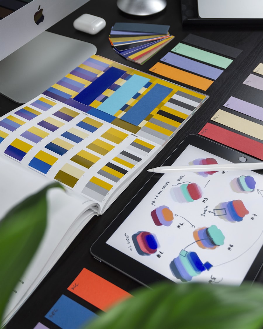
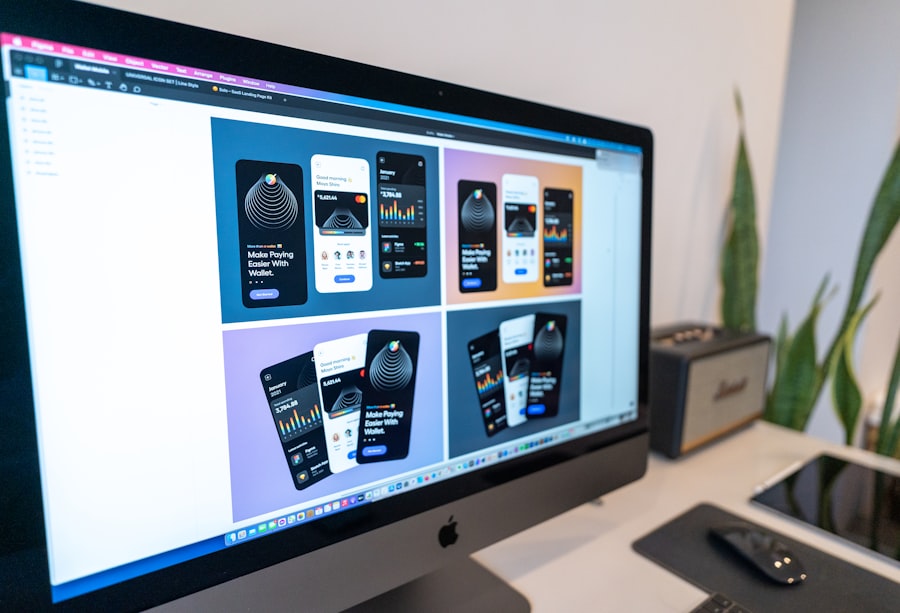
UI design is the visual and interactive layer people actually touch. A UI designer turns wireframes into finished screens: the grid, typography, colour palette, icons, button styles, form fields, spacing, and every state a component can be in (default, hover, pressed, disabled, loading, error).
Good UI is not decoration. It creates visual hierarchy so the most important action stands out, makes text readable on a budget phone in bright sunlight, and keeps the product consistent with your brand. UI deliverables are high-fidelity mock-ups, a component library or style guide, and specs that developers can build from.
How do UI and UX differ?
A simple way to separate them: UX answers “does this work for the person using it?”, while UI answers “is it clear, consistent and pleasant to look at?”. The table below sets out the practical differences.
| UX design | UI design | |
|---|---|---|
| Core question | Can people complete their task easily? | Is each screen clear, consistent and on-brand? |
| Focus | Flows, structure, content, logic | Layout, colour, type, components, motion |
| Main outputs | Research notes, user flows, wireframes, prototypes | High-fidelity mock-ups, style guide, component library |
| When it happens | Early: before and during scoping | After the structure is agreed |
| How you measure it | Task completion, drop-off, support queries | Readability, consistency, accessibility, brand fit |
| Cost of skipping it | A beautiful product nobody can use | A usable product that looks untrustworthy |
How do UI and UX work together? A worked example
Imagine a Kochi distributor that wants field staff to raise GST invoices from a phone. The UX work discovers that staff often lose network inside warehouses, that most invoices repeat the same ten customers, and that payment usually comes by UPI on the spot. So the flow puts recent customers first, saves drafts offline, and offers a UPI QR straight after the invoice is created.
The UI work then makes that flow obvious: a large “New invoice” button within thumb reach, clear totals with GST split into CGST and SGST, a high-contrast layout readable outdoors, and labels that work in both English and Malayalam. Neither half alone would have produced a tool staff actually use.
Why does the difference matter for your business?
Treating design as “making it look nice” is the most common reason small business websites and apps underperform. A fresh visual coat on a confusing checkout or enquiry form rarely moves the numbers, because the problem was never the colours.
Knowing the difference helps you brief agencies properly, read proposals critically and spend money where the problem actually is. Watch for these signs of an imbalance:
- Strong UI, weak UX: the site wins compliments but enquiries are low, forms are abandoned, and staff still answer the same basic questions on WhatsApp.
- Strong UX, weak UI: the flow is logical but buttons are hard to spot, text is small or low-contrast, and the product does not feel credible enough for people to enter payment details.
- Weak both: features were added one by one over years, every screen looks different, and new staff need training just to navigate.
- A redesign that changed nothing: the agency delivered new visuals without research or testing, so the same drop-off points remain.
Do you need a UI designer, a UX designer, or both?
For most small and mid-size businesses, one experienced product designer or a small agency team covers both. Large companies split the roles because the volume of work justifies it; a single brochure website or a first app usually does not.
- Mostly UI work: a brochure website with a clear, simple purpose, a refresh of an existing product that already works well, or marketing landing pages.
- Mostly UX work: an internal tool, ERP or booking system with complex workflows, a product with high drop-off, or anything where users must complete multi-step tasks.
- Both, properly: a new customer-facing app, an e-commerce store, or any product where conversion and trust drive revenue.
As a typical 2026 India market range, design-only work for a small business website runs from roughly ₹40,000 to ₹2 lakh, while full UX and UI for a new mobile app or web product commonly falls between ₹1.5 lakh and ₹8 lakh. These ranges vary widely with the number of screens, the depth of research and how many rounds of testing are included.
What should you ask for in a design proposal?
A proposal that lists only “homepage design, inner page design, logo placement” is a UI-only scope. If your problem is conversion or usability, ask the agency to show how UX is covered. Useful questions:
- Who will you talk to or observe before designing, and how many users?
- Will we see wireframes or a clickable prototype before visual design starts?
- How will you test the design with real users, and what happens if testing shows a problem?
- Will you deliver a reusable component library or style guide, not just flat screens?
- How will you check accessibility, such as text contrast and touch target sizes on phones?
Vague answers are a warning sign. A team that plans to “take your inputs” and go straight to polished mock-ups is selling UI only. That is fine for a simple brochure site, but not for a product where people must register, book, order or pay, because those flows are exactly where untested assumptions cost you customers.
If a product is already live, a short review is often the best first step; see When Should You Run a UX Audit? Seven Warning Signs. Once you have several screens and a growing team, a shared library keeps UI decisions consistent, as covered in Design Systems: How to Keep a Growing Product Consistent.