01
UX Research & Strategy
Interviews, analytics and competitor reviews that reveal what users need and where they get stuck.
- User interviews & surveys
- Personas & journey maps
- Competitor benchmarking
Research-led UI/UX design for websites, mobile apps and SaaS products. We turn complex journeys into simple, beautiful flows that lift conversions and keep users coming back.
Every project includes
Client problem
“People sign up but drop off before finishing onboarding. We need a flow they actually complete.”













Whether you are launching something new or fixing what is not working, we design experiences grounded in how your users really behave.
Interviews, analytics and competitor reviews that reveal what users need and where they get stuck.
On-brand, pixel-precise interfaces that look great and work intuitively on every screen size.
Complex products and data-heavy dashboards made clear enough for people to use every day.
Micro-interactions and transitions that guide attention, give feedback and make products feel alive.
Reusable components, tokens and guidelines that keep a growing product consistent and faster to build.
An expert review of your existing website or app, with prioritised fixes ranked by impact and effort.
Industry-standard tools from research to handoff, so your designs slot straight into your team and your developers’ workflow.
17 tools · 4 disciplines
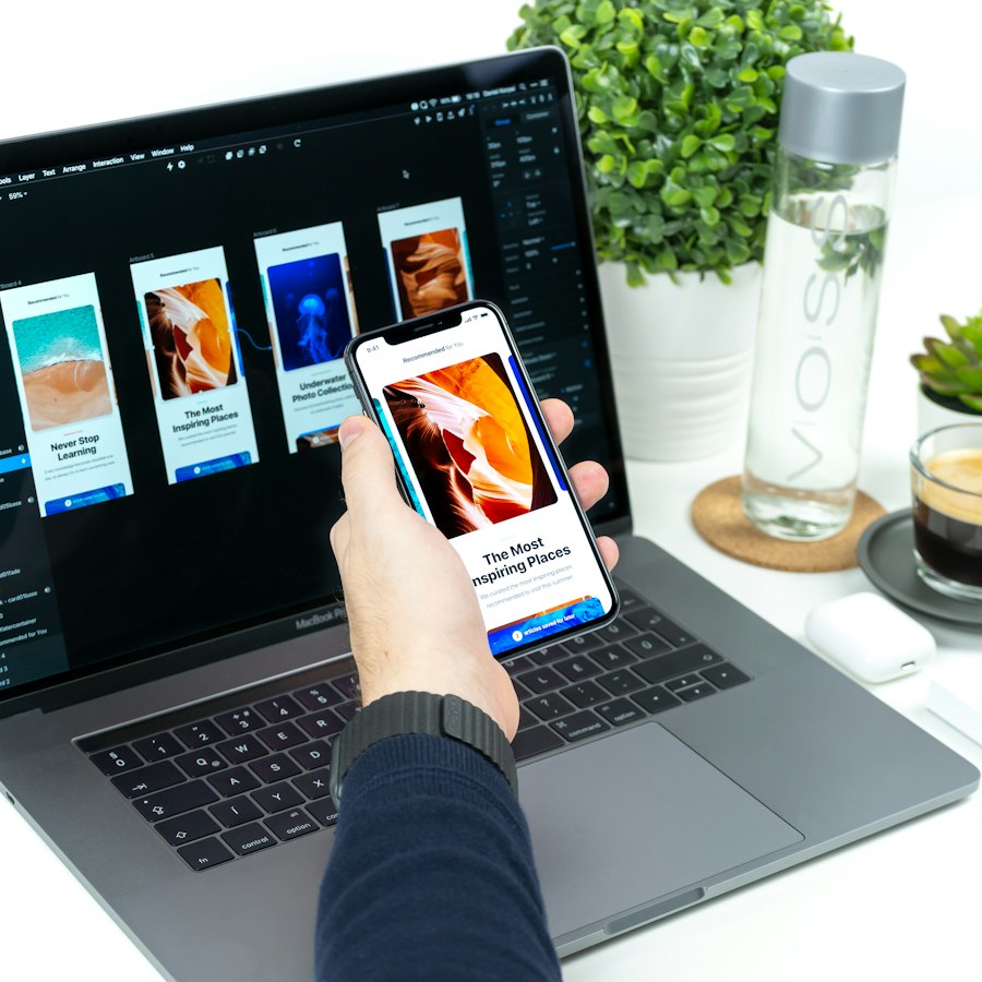
Figma
Collaborative interface design, shared live with your team.
FigJam
Workshops, user flows and journey maps on one board.
Adobe Illustrator
Custom icons, illustrations and vector artwork.
Photoshop
Image editing and visual compositing.
Figma Prototyping
Clickable flows for reviews and user testing.
ProtoPie
High-fidelity prototypes with real device sensors.
Framer
Interactive, code-backed prototypes and sites.
After Effects
Motion design for transitions and product videos.
Lottie
Lightweight animations that ship in the real product.
Maze
Remote usability testing with measurable results.
Hotjar
Heatmaps, recordings and on-page feedback.
Microsoft Clarity
Free session recordings and rage-click detection.
Google Analytics
Funnels and behaviour data behind every decision.
Figma Dev Mode
Specs, tokens and assets developers can inspect.
Storybook
Living component library shared with engineering.
Notion
Research notes, decisions and documentation.
Jira
Design tasks tracked alongside development.
A user-centred process that validates ideas early, so you invest in what works before a line of code is written.
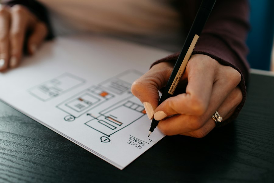
Stakeholder workshops, user interviews and analytics reviews to understand your users, goals and constraints.
Journey maps, information architecture and user flows that organise content the way users expect.
Low-fidelity layouts that settle structure and hierarchy quickly, before any visual polish.
High-fidelity UI with your brand’s typography, colour and imagery, designed for every breakpoint.
Clickable prototypes tested with real users, with the results used to refine the design.
Developer-ready files, a component library and design specs, with designers on hand throughout the build.
Post-launch analytics, heatmaps and feedback reviews that feed continuous design improvements.
Good design is not decoration. It is how people decide in seconds whether to trust your product.
Every design decision traces back to real user evidence, not guesswork or personal taste.
Our designers sit with our engineers, so what we design is practical to build and ships as intended.
We define success metrics up front, such as conversion, task completion and retention, and design towards them.
Contrast, focus states, readable type and screen-reader support are part of the design, not an afterthought.
Design systems and documented components keep your product coherent as new features and teams arrive.
The same team can build what we design, as a website, mobile app or custom software, with nothing lost in handoff.
We have designed products and experiences for businesses across these sectors.
Design investment depends on the number of screens, research depth and platforms. Pick the engagement that fits, and we will send a clear, itemised proposal.
Best for: Existing sites and apps that underperform
Best for: New products and full redesigns
Best for: Products with a continuous roadmap
UX (user experience) design is about how a product works: the research, structure and flows that help users achieve their goals. UI (user interface) design is how it looks and feels: layout, typography, colour and interactive elements. Great products need both, and we deliver them together.
A UX audit is worth doing when conversions or sign-ups are lower than expected, users drop off at a particular step, support requests keep repeating, or before a redesign so you know exactly what to fix and what to keep.
A UX audit typically takes 2–3 weeks. Designing a website usually takes 4–8 weeks, and a mobile app or SaaS product 6–12 weeks depending on the number of screens and the depth of research and testing.
You get organised Figma files, a clickable prototype, a style guide or design system, and developer-ready specs and assets. All design files are yours to keep and use.
Yes. Our in-house engineers can build your design as a website, mobile app or custom software, so the finished product matches the design exactly. We also hand off cleanly to your own developers if you prefer.
Yes. We design with the platform in mind, whether that is Shopify, WordPress or a custom build, so the design works within its capabilities and is practical to implement.



Tell us about your product and your users. We will review your brief, set up a short discovery call and send a clear, itemised proposal.
Prefer to talk?