
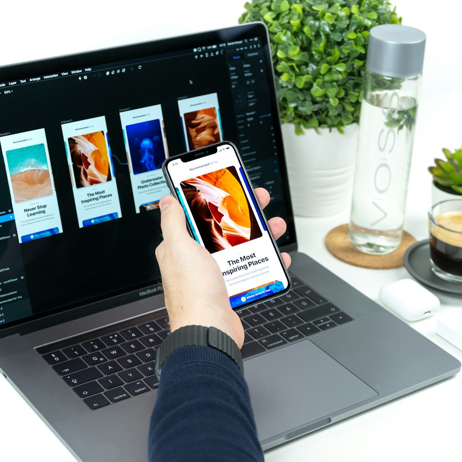
What does mobile-first actually mean?
Mobile-first is a design order, not just a screen size. You design the phone experience first, with its tight space and touch input, and then expand the layout for tablets and desktops. The opposite approach, designing for a wide monitor and squeezing it down, usually produces cramped menus, tiny links and pages that scroll forever.
Starting small forces useful discipline. With room for one main action per screen, you have to decide what matters most to the visitor. That clarity usually improves the desktop version too.
The larger screen then becomes an enhancement rather than the starting point. Desktop can add side-by-side comparisons, wider tables, hover previews and extra filters, while the phone keeps a single, focused column. Each version is designed on purpose, instead of one being a squashed copy of the other.
Why does it matter so much for Indian businesses?
For most Indian consumer-facing businesses, phones are the main way customers find, compare and contact you. Many customers have never used your website on a laptop at all; they arrive from Google search, Instagram or a WhatsApp link, on a mid-range Android phone, often on mobile data.
Check your own analytics rather than relying on general claims. If the majority of your visitors are on mobile, which is typical for retail, hospitality, healthcare, education and local services, then the mobile experience is your real website and the desktop version is the secondary one.
How do thumbs change the layout?
Most people hold a phone in one hand and tap with their thumb. The lower and middle part of the screen is easy to reach; the top corners are a stretch, especially on large phones. Good mobile layouts respect this “thumb zone”:
- Primary actions low: put “Book now”, “Add to cart” or “Call” in a sticky bar at the bottom of the screen, not only in the header.
- Bottom navigation for apps: three to five main destinations in a bottom tab bar are easier to reach than a menu in the top corner.
- Large tap targets: Apple’s guidance is at least 44 × 44 points and Google’s Material Design guidance is at least 48 × 48 dp. Leave space between targets so people do not hit the wrong one.
- No hover-dependent features: there is no hover on a touchscreen, so menus, tooltips and image zoom must work with a tap.
- Destructive actions out of easy reach: keep “Delete” or “Cancel order” away from the main button and ask for confirmation.
How do you design forms and checkout for mobile?
Typing on a phone is slow and error-prone, so every field you remove helps. Forms are where mobile visitors most often give up, and they are usually the easiest place to win them back.
| Problem | Mobile-first fix |
|---|---|
| Long enquiry form | Ask only name, phone and one question; collect the rest later by call or WhatsApp |
| Wrong keyboard appears | Show the numeric keypad for phone numbers, PIN codes, OTPs and amounts |
| Typing OTPs by hand | Enable one-time-code autofill so the SMS code fills itself |
| Re-typing addresses | Support browser autofill and look up city and state from the PIN code |
| Page zooms when typing (iPhone) | Use at least 16 px font size in input fields |
| Errors shown only after submit | Validate each field as the user leaves it, with a clear message beside it |
| Forced account creation | Offer guest checkout with phone-number login as an option |
| Unfamiliar payment step | Show UPI prominently, with app buttons on mobile and a QR code on desktop |
Also offer a one-tap WhatsApp or call button as an alternative to the form. Many customers in Kerala are more comfortable starting with a quick chat than filling in fields, and a visible option keeps them from leaving.
Why is speed part of mobile UX?
A beautiful mobile layout fails if it takes too long to appear on a mid-range phone with patchy coverage. Google’s Core Web Vitals give clear targets measured on real visits: Largest Contentful Paint within 2.5 seconds, Interaction to Next Paint within 200 milliseconds and Cumulative Layout Shift below 0.1.
- Serve images in modern formats such as WebP, sized for the phone screen rather than a desktop banner.
- Avoid auto-playing hero videos and heavy sliders on mobile.
- Limit third-party scripts such as chat widgets, trackers and pop-ups, which slow interaction.
- Reserve space for images and ads so the page does not jump while loading.
For a fuller explanation of the three metrics, read Core Web Vitals Explained: Why Site Speed Is a Revenue Metric.
What about content, language and readability?
Small screens punish long paragraphs. Lead with the answer, keep paragraphs short, and use headings people can scan while scrolling. Body text of around 16 px is a sensible minimum, with strong contrast, since phones are often read outdoors in bright light.
If you serve Malayalam and English audiences, test both. Malayalam script typically needs more line height and often more horizontal space than the English equivalent, so buttons and menus designed only in English can break. Make the language switch easy to find, and remember the choice for the next visit.
Pop-ups deserve special care. A newsletter or offer pop-up that covers the whole phone screen, with a tiny close button in the top corner, is one of the quickest ways to lose a mobile visitor. If you must use one, delay it, keep it small, and make it easy to dismiss.
How should you test a mobile design?
Browser resizing on a laptop is not enough. Test on real devices that match your customers, which in India usually means a mid-range Android phone alongside an iPhone.
- Complete your main task (enquire, book, buy, pay) one-handed on a mid-range Android phone.
- Repeat it on slow mobile data, or with network throttling switched on.
- Try it outdoors in daylight to check contrast and text size.
- Ask two or three customers or staff to try it while you watch without helping.
- Check field data in Google Search Console for Core Web Vitals on mobile.
If the product also has data-heavy screens, the same principles apply to reports; see Designing Dashboards People Actually Understand.