We didn’t draw a car or a key. We drew what keeps them moving.
Nobody opens a rental business to manage bookings, handovers and payments. They do it for the cars, the bikes and the customers. TheRentOS looks after the rest, and its identity had to make that invisible work feel like something you’d trust with your keys.
The product
TheRentOS, an operating system for rental businesses, part of the Zeekoi ecosystem.
What we built
A mark, a wordmark with an activation dot, a chain pattern, a four-colour palette, a type pairing and app icons.
The brand book
Logo design file, 16 pages. Typefaces Vision and Pixel Operator.
Reading time
12 minutes, or 30 seconds below.
The 30-second version
If you only read one part, read this.
The problem
The better it works, the less anyone sees it.
Bookings, vehicles, customers and payments live in chat threads, notebooks and spreadsheets. TheRentOS joins them up, and then there is nothing left to look at.
The insight
Don’t draw what it rents. Draw what it connects.
Every picture of renting ties a brand to one kind of business. The name already held a better answer: the letters O and S.
The idea
A mark built from OS, a chain that is the logo unrolled, and a dot that says it’s awake.
Four equal circles on equal links, a pattern made of the same four, and one signal that switches on.
What we delivered
One system, 16 pages.
Mark, wordmark, chain pattern, four colours, two typefaces, app icons, and the identity at work on a laptop, a phone and a bottle.
Here’s the trouble with branding a back office: the better it works, the less anyone notices it. There’s nothing to photograph and nothing to paint on the side of a van. So we stopped looking for a picture of what TheRentOS does and looked at what it’s made of. Two letters, O and S. From those, a mark. From the mark, a chain. And at the start of the name, one small dot that says the system is awake. This is how we got there.
The long version01 / The problem
Eight in the morning, and the business is in four places.
Picture a rental counter first thing. One booking came in overnight on WhatsApp. Another is in the notebook. The bike due back is still out, a deposit has landed in a payment app, and someone is asking whether Saturday is free. None of it is hard. All of it has to agree with everything else, and the person holding it together is usually the owner.
Software vendors who sell to rental shops describe the same scene: bookings scattered across spreadsheets, chat groups and paper, with the double booking as the classic slip. That is the part TheRentOS takes over. When it works, nobody notices, which is exactly the branding problem.
The world around that counter
The five leading players together hold about this share of India’s two-wheeler rental market. The rest is a long tail of small operators.
Share of India’s car rental market booked through websites or apps in 2025. Customers already arrive through screens.
UPI payments in October 2026 alone, worth ₹31.53 lakh crore. Money already moves by phone.
A vendor forecast for India’s self-drive car rental market by 2031, up from US$141 million in 2025.
Handle with care: vendor estimates for this category disagree widely. Two-wheeler rental is sized at about US$78 million by MarkNtel and US$9.2 billion by IMARC, depending on the definition, so we use these numbers for direction, not size.
Watch it happen
One booking, four hiding places. Keep scrolling and watch them become one.
A WhatsApp thread, a notebook, a spreadsheet and a payment app, joined into a single system.
02 / The insight
Rental brands draw the vehicle. We went looking for the system behind it.
The easy answer is a picture of renting. From where we stood we could see five of them, and we shut each one for a reason.
The car
Instantly clear, and instantly limiting. The moment a car is the logo, a bike shop, a scooter fleet or a camera-hire counter becomes a guest in someone else’s house.
The key
Every rental brand has used one, which is why it says nothing. And a key is only the handover, one minute of a business that runs all day.
The calendar
Booking is half the job and the least special half. A calendar makes this look like every scheduling tool, and hides everything after the booking.
The map pin
Pins belong to maps, taxis and delivery. It says where something is, not how a business is run.
The gear or cloud
The universal software logo. Safe, forgettable, and it would fit any product in the world, which is the opposite of what a mark is for.
The book closes all five roads in one line. It says the logo is a symbol of running a system, not of renting, and that it deliberately avoids standing for any single rental category.
That left one place to look: the name. TheRentOS has two letters in it that were already a logo waiting to happen.
03 / The idea
The logo was already in the name.
Two letters, four circles, one path. Scroll and watch it come together. The drawings are the book’s own, and the measurements are ours, taken from the vector artwork in the logo file.
The S is already a route.
Of all the letters, S is the one that looks most like a route: one unbroken line that turns left, then right, and never doubles back.
The book says the identity is born directly from the word OS, and its first move is to take that S apart.
A letter that already looks like a journey.The O supplies the circles.
The mark is carved from the negative curves of the S and circular forms taken from the O, so both letters of OS end up inside it.
This is the book’s construction drawing: four node circles, the large arcs that carve the S, and guide circles that place everything inside the tile.
Both letters, one shape.Measure it, and the numbers line up.
We put a ruler on the artwork. The four circles are the same size, to within a fraction of a unit. The three links between them are the same length, about 46 units each. The two longer gaps measure 45.5 and 45.8, so the nodes sit on a strip of near-equilateral triangles.
The book doesn’t say this, and a ruler can’t tell us whether it was intended. But a triangle is the simplest shape that holds its form under load, which is why bridges and cranes are built from them. We read it as a quiet promise: nothing in this chain carries more than its share.
Equal circles. Equal links.Four circles, and no favourites.
The book says each node stands for a key point in the rental journey, and the links between them are how TheRentOS enables access, coordination and exchange. It doesn’t say which node is which, and we haven’t assigned them.
Because the four circles are identical, no stage of a rental looks more important than another. That feels right to us. A missed return hurts as much as a missed booking.
Four stops. None more important.Repeat it and the logo becomes a pattern.
Repeat the mark and its circles become a chain, the pattern that runs down the edge of the brand book’s pages. The book is exact about it: the unit is the four nodes of the mark, unchanged, and each repeat sits 0.85 of the mark’s height below the last, so its top circle tucks in beside the bottom circle of the one above.
The pattern isn’t a second drawing. It’s the logo, unrolled.
The logo, unrolled.Even the curves were checked.
The book documents the mark’s construction against a golden-ratio spiral, with squares of 55, 34, 21 and 13. You may or may not feel the proportion when you look at it. The drawing shows the curves were checked against a ruler instead of left to the eye.
Chosen, not drifted into.04 / The pattern
The pattern isn’t decoration. It’s the logo, unrolled.
Most identity patterns are decoration: shapes picked because they look good beside the logo. This one is the logo. Four circles on alternating sides, repeated until the page ends. Cut it anywhere and the rhythm is the same.
It can’t drift.
Because the chain is built from the mark’s own four circles, it can’t wander away from the logo. Use it anywhere and the brand comes with it.
It zigzags on purpose.
Every circle sits on the opposite side from the last. Press the button and watch a signal cross from side to side.
To us that is a handoff, something passing from one party to the other and back. The book describes the mark as linking businesses and customers, with two-way communication, and a zigzag is what two-way looks like when you draw it.
It never has to end.
A picture has edges. A chain just leaves the page. That is how the book uses it, as a quiet line of motion down the margin, which is the nearest a still page gets to a system that is always on.
05 / The principles
Three big words, and where you can actually see them.
The book gives TheRentOS three principles: connection, intelligence and control. They’re easy to say and easy to ignore, so we looked for the place in the identity where each one actually shows up.
You can see it in the chain.
Four circles, joined by links, repeating. Bookings, vehicles, customers, payments and data in one place instead of five, drawn as the thing it is.
From the book: it brings assets, workflows, customers, payments and data together in one intelligent environment.
You can feel it in the calm.
One mark, one signal colour, and no decoration that isn’t the logo. Good systems work quietly while you’re busy, and the identity behaves the same way.
From the book: like an operating system, it runs quietly while orchestrating many processes at once.
You can press it in the dot.
The one part of the identity that switches on and off, and the reason we think the owner stays in charge. It is the next section.
From the book: the dot stands for precision and real-time control.
06 / The dot
The smallest thing in the logo does the most work.
Almost every piece of software you use has a dot like this one: the green light beside a name, the unread badge, the “online” bubble. It’s the oldest way an interface says someone is home. The book calls this one the activation point, the moment a business goes live and starts connecting with its customers.
Measured on the artwork, it is the same cyan as the OS at the other end of the name, so the signal is there at the start of the word and at the end. It is about as wide as the stem of the t beside it, and sits a quarter of its own width away, close enough to belong and far enough to read as its own thing.
We think of it as the chain’s first circle, waiting. It hasn’t joined anything yet. Press the button to see what going live looks like.
07 / The wordmark
Say it out loud: the signal sits at both ends of the word.
The dot, then a lowercase “the”, then “Rent”, then “OS” in Active Cyan. Tap a part to isolate it.
08 / Colour
Navy to be trusted. Cyan to mean something.
The book names and specifies four colours. Tap one to open its numbers and the job we give it.
CMYK 100, 96, 32, 28
The night shift. Deep, calm and dependable, the colour of software you leave open all day.
CMYK 63, 8, 0, 0
The signal. Used sparingly, so when you see it, something is live, selected or ready.
CMYK 75, 68, 67, 90
The type. Plain and legible, for the things people must read to get a job done.
CMYK 0, 0, 0, 0
The canvas. Room for the work, and for each business to put its own name.
The four, sharing one screen.
Here is how we imagine them dividing a working screen: navy as the frame, white as the page, black for what you read, and cyan only where something is live.
09 / Type
A friendly voice, and a machine’s.
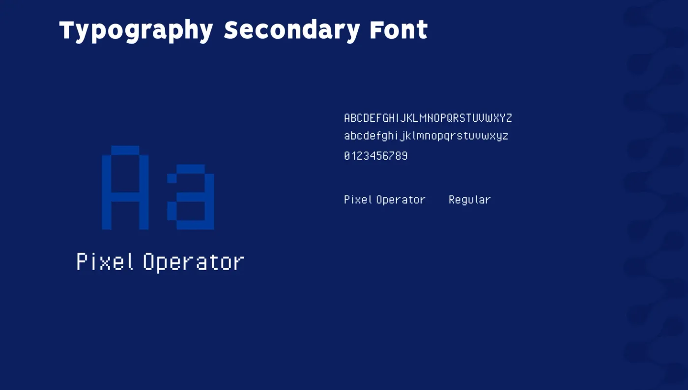
Two typefaces, as different as they could be on purpose. Vision is warm and round, from Thin to Black. Pixel Operator is built on a pixel grid, the way early screens drew letters. These are the book’s own specimens.
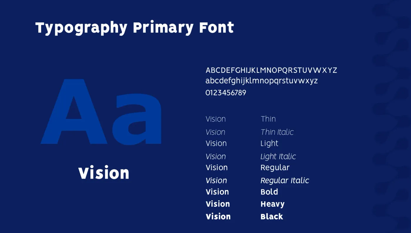
Vision speaks.
Anything a person reads: headlines, explanations, buttons. Nine styles from Thin to Black let one family carry a whole interface.
Pixel Operator reports.
Anything the system says about itself: statuses, timestamps, small labels. Look at the two together. The logo is made of round circles, the type of square pixels, and the pairing keeps both shapes in the system.
10 / The system
Six versions, and it still reads at a quarter of the size.
The book shows the horizontal logo at 100, 75, 50 and 25 percent with its geometry and spacing intact. Drag the slider to test it, then see the full set of variations.
11 / The applications
A software brand you could hand out on a water bottle.
The identity at work in three places: the live website, and two of the book’s own application mockups.
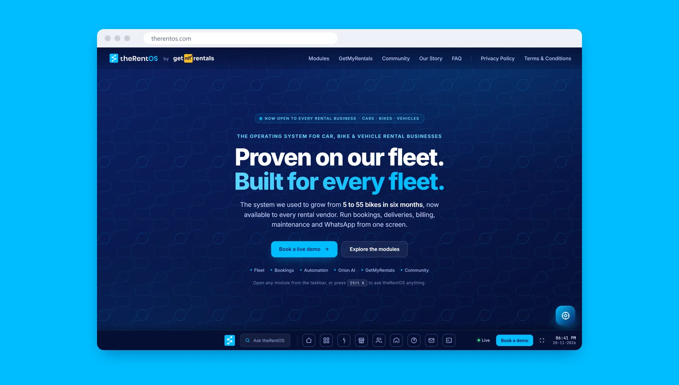
The website
The live home page at therentos.com calls it “the operating system for car, bike & vehicle rental businesses” and opens on “Proven on our fleet. Built for every fleet.”, set over the brand pattern, with the cyan kept for one button: Book a live demo. Notice what isn’t there: no car, no bike, no key.

The home screen
One cyan tile among loud neighbours. It’s the quickest test of any app icon: can you find it in a second?

The bottle
The logo in cyan on silver and on black. A water bottle is an honest test for a software brand, because somebody has to want to carry it.
The icon, square and round.
The book sets the mark as an app icon in two shapes, a cyan square and a navy circle, each with a notification badge. The small red badge is the only colour outside the palette, and it belongs to the phone, not to the brand.
12 / The rules
Six rules, so the idea survives the next ten designers.
The logo file doesn’t include usage rules, so these are ours: the short list we would hand to anyone building on the identity, each with its reason.
No vehicles in the mark.
The whole idea is that it isn’t a symbol of renting. The day a car appears, every business that isn’t a car business becomes a guest.
Keep the circles equal.
Four identical circles on equal links. Enlarge one and you’ve told the customer that one stage of a rental matters more than the rest.
Cyan means live.
Keep Active Cyan for things that are on, selected or ready. If everything is cyan, nothing is a signal.
Give the dot room.
Keep it beside the t and don’t crowd it. It is the one part of the logo that says the system is awake.
Let the chain run to the edge.
One pattern, at the margin of a layout, running off the page. It is a line of motion, not wallpaper.
Vision speaks, Pixel Operator reports.
Warm type for people, pixel type for the system. Mix them up and the two voices blur into one.
13 / Questions
Questions people ask about a software brand.
The questions we would expect from anyone weighing an identity like this, answered from the brand book, our measurements and the research.
What did Zeekoi create for TheRentOS?
A complete logo system: the symbol, the wordmark with its activation dot, a horizontal lockup, a chain pattern drawn from the mark, a four-colour palette, a primary and a secondary typeface, size and colour variations, app icons, and applications on a phone, a website and a bottle.
All of it sits in one 16-page file, and every vector on this page comes from it.
Why is there no car, bike or key in the logo?
Because the book is explicit that the logo is a symbol of running a system, not of renting, and that it deliberately avoids standing for any single rental category.
Our reasoning is on the page above: every obvious picture of renting locks the brand to one kind of business or one moment of it, and TheRentOS is for all of them, all day.
Where does the symbol come from?
From the name. The book says the identity is born directly from the word OS, and that the mark is built from the negative curves of the S and circular forms taken from the O.
It describes the result as a chain of connection linking businesses and customers through one intelligent system, with each node standing for a key point in the rental journey. The book doesn’t say which node is which, and we haven’t assigned them.
How do you know the four circles are equal?
We measured the vector drawing in the logo file. The four circles have radii of 10.05, 10.12, 10.09 and 10.07 units, and the three links between them are 46.4, 46.2 and 46.2 units long.
The book doesn’t state any of this. It is what the geometry shows when you put a ruler on it, and whether it was intended is the one thing a ruler can’t tell you.
Is the pattern really the logo?
Yes, literally. The brand book builds the pattern only from the logo-mark nodes, the exact same shape as the icon, never redrawn or mirrored. Each repeat sits 0.85 of the mark’s height below the last, so the circles keep alternating right, left, right, left, and in a full field the columns are offset by half a repeat.
Every pattern on this page is built that way, from the mark’s own vector.
Why is there a dot beside the t?
The book calls it the system’s activation point: the moment a business goes live and connects with its customers. Inspired by software interfaces, it signals automation, connectivity, precision and real-time control.
On the artwork it is the same cyan as the OS at the other end of the name, about as wide as the stem of the t beside it, and about a quarter of its own width away. It is the only element in the logo that has a state, which is why it has its own section above.
Which colours and typefaces does it use?
Four colours: System Navy (#0b1f5e), Active Cyan (#00bdff), Core Black (#000000) and Canvas White (#ffffff), each specified in HEX, RGB and CMYK. The primary typeface is Vision, set from Thin to Black with italics. The secondary is Pixel Operator in a single Regular weight.
Page text here is set in Mulish, a close web stand-in, because Vision is licensed separately. The specimens in the type section are the book’s own.
Does it still work small, or on its own?
The book shows the horizontal logo at 100, 75, 50 and 25 percent with its geometry and spacing preserved at every step, and the size slider above lets you test it yourself.
It also sets the horizontal logo on white and on navy, the mark alone as a cyan tile and a white tile, the wordmark alone on both grounds, and the mark as a square and a round app icon with a notification badge.
How does a software brand earn trust before anyone logs in?
Our view, not the book’s: by looking finished and specific rather than loud. One mark with a clear idea behind it, one signal colour used with discipline, one small element that behaves like the product, and applications that look like they exist.
Owners of small businesses are asked to hand over bookings, vehicles and payments. A brand that is calm and consistent is a quiet way of saying the system will be too.
Who is TheRentOS for, and how big is that market?
It is for businesses that rent assets out, which the book calls access-based businesses; its website, therentos.com, calls it “the operating system for car, bike & vehicle rental businesses”. Six rental businesses have been onboarded so far.
On size, vendor estimates disagree by orders of magnitude depending on how the category is defined, so we treat them as direction only. India’s two-wheeler rental market is put at about US$78 million by one vendor and US$9.2 billion by another, and a third forecasts self-drive car rental growing from US$141 million to US$312 million by 2031.