
Everyone sells the ride. We built a brand riders can experience before they rent.
LocoRides rents bikes and scooters in Varkala. Zeekoi built its identity to be understood at a glance: a palette that matches the plate already marking a rental on Kerala roads, and a logo that stays recognisable from a helmet to a phone screen.
- Client
- LocoRides
- Category
- Self-drive two-wheeler rental
- Where
- Varkala, Kerala
- Work
- Identity system and brand book, 2025
01 / The doubt
Every rental starts with a small doubt.
A traveller lands in Varkala, wants a bike for the week, and hands an ID and a deposit to someone they met an hour ago.
Three questions sit behind that handover.
- Q1Is this bike even allowed to be rented?
- Q2If something goes wrong, will the insurance pay?
- Q3Whose bike is it, really?
Kerala put the first answer where a rider can see it, on the number plate.
02 / The plate
So we read the plate first.
The one thing on a rental that already says what it is.
A private bike wears white.
Rent one out quietly and Kerala’s warnings are blunt: seizure, insurance that won’t pay, a renter answering questions at the roadside. Those warnings were written about cars. Riders pass the same one around about bikes.
A rental wears yellow on black.
Black plate, yellow lettering. It marks a vehicle authorised for self-drive hire, and a rider can check it from the kerb, before a rupee changes hands.
Count the colours.
Two. Black, and a warm yellow. Keep that in your head while we open the LocoRides brand book.
What the brand book says.
Fire Yellow, #fda50f. Black, #000000. It calls them the primary colours and gives them charge of every brand element. A plate’s yellow and Fire Yellow aren’t the same shade. The pairing is the point.
The plate learns a name.
Put the logo where the number would sit and the idea is plain: an identity dressed in the colours the category already uses to say rental.
Go and read the next plate you pass.03 / The rest of the palette
Yellow and black do the talking. Three colours listen.
The brand book keeps Bright Orange, Gray and Curious Blue for depth and balance, in visuals, icons and supporting graphics. The lead stays with yellow and black.
For banners, headers and hero sections, where a flat colour would sit still.
04 / The mark
Then we drew a bike out of the name.
The wheels were already in the letters.
Start with the name.
L, O, C, O. Four letters. Nothing clever yet.
The last O is already a wheel.
It is the only letter drawn big enough to roll. The brand book says the logo combines a bike’s shape with the name. This is where the bike starts.
The L carries the other one.
A curve trails under the L and becomes the rear tyre. Two tyres, and the other letters sit between them.
Then the body arrives.
Seat, tank and fork settle above the letters in Fire Yellow. Nothing had to be added to the name. It only had to be seen from the side.
RIDES goes between the tyres.
Bottom centre, small and steady. The word that says what the brand does sits where the bike carries its weight.
A wordmark you could draw from memory.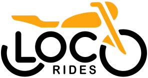

05 / The wheel
A wheel that never finishes turning.
The brand pattern starts where the logo does: a tyre, and the O and C of LOCO. Then come the rules. Half circles on corners, or scattered. No more than three on a flyer. Never a whole circle in a single design.
A circle you never see completed is a wheel that is still turning.Our reading of the rules above


Flyer layouts are concept applications from the brand book.
06 / The line
One line that never lifts.
The second pattern writes LOCO again and again as a single stroke. The top of each last O runs on into the next L, so the line carries on without a break. The book asks for at least three LOCO units in a row. Any fewer and the idea falls apart.
The pattern takes any brand colour. The only demand is strong contrast against the background.
07 / Day and night
Morning yellow. Night black.
The app icon comes in two moods: a yellow squircle with the logo in black, and a black one for after dark. Same bike, different light.

08 / On the road
Where the pattern meets the machine.
On a fuel tank, on a helmet, on a flyer. Always part of a wheel, never the whole of one.
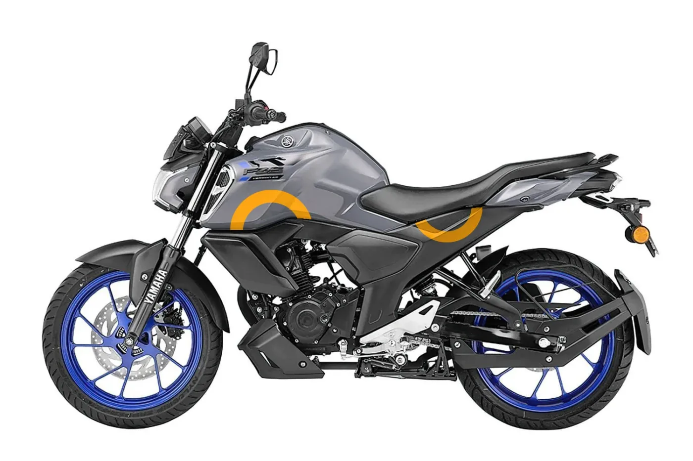
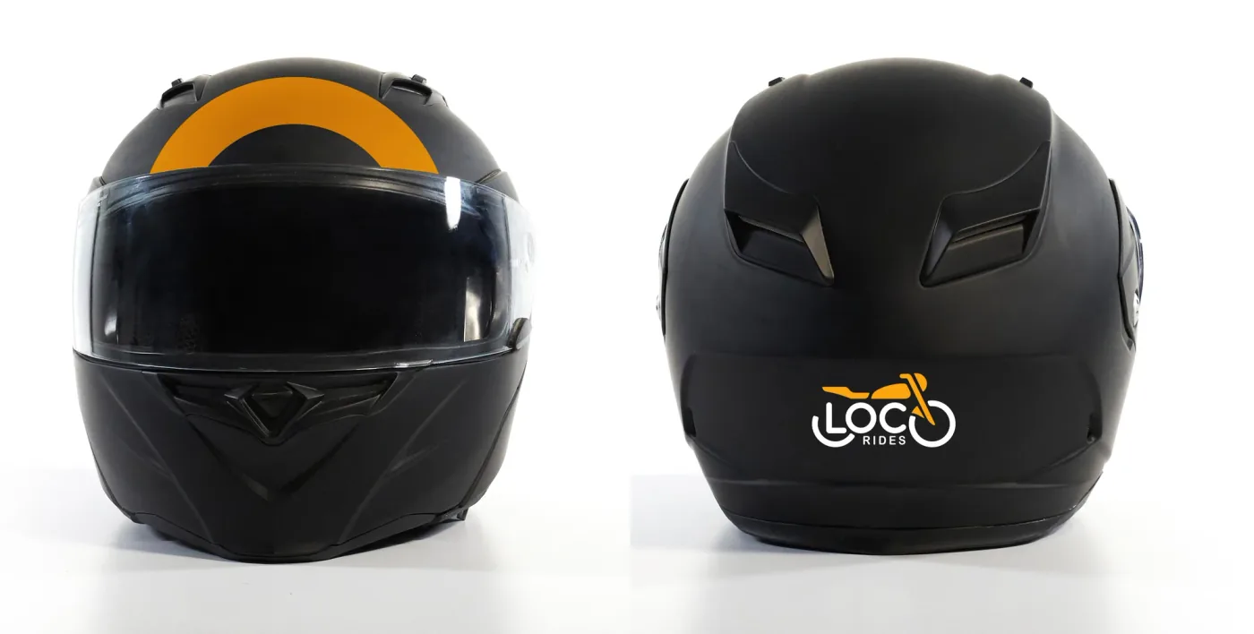
All applications shown are concept applications from the brand book, not delivered fleet work.
09 / The rulebook
Short rules, so they get followed.
A brand that lives on bikes, helmets and phone screens needs rules that fit on one hand.
Clear space
The height of the word RIDES, kept free on every side.
Five places
Top left, top centre and top right come first. Bottom centre and bottom right are the fallback. Nowhere else.
Never
- Recolour it
- Squash or stretch it
- Add shadows or bevels
- Space the letters out
- Fade it
- Resize single letters
- Rotate it
- Crop it
10 / The conclusion
Yellow, black and a wheel that keeps turning.
A rider decides in seconds whether a rental feels right. The LocoRides identity gives them three things to hold on to.
- 01 / Colour
Yellow on black, like the plate.
Fire Yellow and Black echo the pairing on a rental plate, a link we read into the brand book rather than one it states. Bright Orange, Gray and Curious Blue stay in support.
- 02 / Mark
A bike drawn out of the name.
The last O is the front wheel, the foot of the L is the rear one, and RIDES sits between the tyres. The name already held the bike.
- 03 / Pattern
Two patterns that never finish.
Half circles, three at most and never a whole one, plus a single LOCO line that never lifts. The rings appear on flyers, a fuel tank and a helmet.
An identity a rider can read at a glance, from the kerb to the phone screen.
This case study covers the identity system. It does not report rental volumes or sales, and we won’t make any up. Measured results can be added once LocoRides shares them.
Questions
Asked and answered.
What did Zeekoi deliver for LocoRides?
An identity system and brand book, in 2025: three logo versions, two primary colours with three supporting ones and a single blend, two patterns, day and night app icons, a short rulebook for clear space, placement and misuse, and two typefaces.
Why is the palette yellow and black?
The brand book names Fire Yellow (#fda50f) and Black (#000000) as the primary colours but gives no reason. Our reading is that they match the pairing on a rental plate, so the identity already looks like the category it belongs to.
How sure are you about the plate colours?
Confident for cars, less so for bikes. An Onmanorama report says authorised self-drive rentals in Kerala carry black plates with yellow lettering, but it is about cars. For bikes, rental-industry guides say the same, while the central rental scheme sets no plate colour, one state circular describes a yellow plate with black lettering, and at least one guide reverses the rule.
How does a logo end up looking like a bike?
The last O reads as the front wheel and the foot of the L as the rear wheel, with the seat, tank and fork in Fire Yellow above and RIDES between the tyres. The brand book says the logo combines a bike’s shape with the name; the wheel-by-wheel reading is ours.
Why is there never a whole circle in the pattern?
The brand book’s rules call for half circles on corners or scattered, three at most on a flyer, and never a full circle in one design. Our reading is that a circle you never see completed is a wheel still turning.
Can the LOCO line pattern use other colours?
Yes. It takes any brand colour, as long as the contrast against the background is strong. The book asks for at least three LOCO units in a row; any fewer and the idea falls apart.
Something we didn’t cover? Ask us directly