
Everyone sells more choice. We built a brand that sells certainty.
Rajasthan Marbles has helped people build since 1984. Zeekoi gave that reputation one calm, recognisable face, and found the entire visual system hiding inside a single letter of its logo.

Hint: this arch is a letter
- Client
- Rajasthan Marbles, building materials since 1984
- What we made
- Brand platform, identity system and a 49-page brand book
- Under one roof
- Tiles, marbles, granites, sanitaryware, paints, kitchen accessories, CP fittings
- Reading time
- 7 minutes, or 30 seconds below
The 30-second version
If you only read one part, read this.
The problem
A noisy market for a once-in-a-decade decision.
Floors, bathrooms and kitchens are chosen once and lived with for years. Buyers face endless options and loud claims.
The insight
People don’t need more options.
They need someone calm to help them choose, and to still be there after the job is done.
The idea
The brand as a guide, and a doorway drawn from its own R.
A calm, expert voice, and a visual system grown entirely from the letters already in the logo.
What we delivered
One system, 49 pages.
Purpose to positioning, 3 logo versions, 7 colours, 4 typefaces, 2 patterns, a voice, and rules for every surface from trucks to tape.
The market
Marble isn’t bought. It’s decided.
Ask anyone who has built a home in India. The flooring, the bathrooms, the kitchen: you choose them once and see them every morning for decades. Get it wrong and the mistake is set in stone.
Psychologists have a name for what that does to a buyer.
Choice overload. Research finds it bites hardest when the options are complex, the decision is difficult and people aren’t sure what they want. Add a contractor on the phone, a family with opinions and a budget that keeps moving.
That’s a tile showroom on a Saturday afternoon. And it was the problem Rajasthan Marbles had been quietly solving for four decades, without a brand that said so.
The insight
People don’t need more options. They need someone calm to help them choose.
People want
To build something that lasts, and to feel sure they chose right.
The category gives them
Noise, pressure and more options than anyone can compare.
Rajasthan Marbles can fix it because
Four decades of advice, and every category a building needs under one roof.
“Every space begins with a decision. Often, those decisions come with doubt. Our purpose is to remove that doubt.”Brand purpose, Rajasthan Marbles brand book
So we gave the brand one role: not the loudest shop on the street, but the guide people come back to, generation after generation. Every decision that follows answers to that.
The letter
Remember the hint? The arch is the R.
Most identities borrow their decoration from somewhere else. We looked inside the logo first, and found a doorway: the place where arrival becomes belonging.
Step 1

Start with the mark: an angular R and M.
Step 2

Isolate the R.
Step 3

Reduce it to its essential curve. Mirror it.
Step 4

Repeat it. A doorway appears.
 RM Continuum, the primary pattern
We called it the RM Continuum. It has no beginning and no end.
The one rule: only one side of the pattern ever appears, and it runs off the edge of the layout. It never looks finished, because a legacy isn’t.
Then we looked at what wasn’t there
Even the gaps in the logo do work.
The negative space inside the monogram became a second pattern, the Rajasthan Hidden Form. It gives surfaces a quiet texture of heritage, craft and elegance, and it is never allowed to compete with the mark.


One letter. Two patterns. Zero borrowed decoration.
The palette
Red to be remembered. Stone to feel at home.
How does a brand feel premium without feeling cold?
Four primary colours carry the weight. Crimson Garnet for power and heritage, kept for emphasis. Rich Gold for craftsmanship, used sparingly. White as the main background, so everything stays clear. Black for strength and structure.
Three secondary colours widen the range without breaking it. Stone Moss Green, Limestone Beige and Terracotta are taken from natural stone and desert landscapes, which is where the products come from.
Why it mattersColour does the warming up. The red gets noticed, and the stone tones make a showroom feel like somewhere you could stay.
Crimson Garnet
Power, heritage and confidence. Used for emphasis and key brand moments.
Rich Gold
Luxury and craftsmanship. Applied sparingly to highlight premium details.
White
Clarity and balance. The primary background for a clean, refined look.
Black
Strength and authority. Used for typography, structure and strong contrast.
Stone Moss Green
Stability and trust. Adds depth and structure to the brand.
Limestone Beige
Warmth and balance. Creates openness and visual clarity.
Terracotta
Craftsmanship and heritage. A warm accent with character.
The type
Four typefaces, and each one knows its place.
What does the brand sound like when it is written down?
Blauer Nue, a clean neo-grotesk, does most of the work in headings and body text. Menda adds weight to a few chosen headlines, usually in capitals. Stellar Regular handles captions and labels.
Pinyon Script is saved for festive, celebratory and emotional moments, and never used for body text. Four voices, one clear hierarchy.
Why it mattersRestraint is what makes the big headline land when it finally appears.
The voice
A voice that never hurries.
How should it sound in a room full of noise?
In a category that leans on urgency and big claims, the brand chose the opposite: plain words, steady confidence, and warmth that never turns into pressure.
Experience, knowledge and legacy do the convincing, quietly.
Why it mattersA voice that stays calm is what makes people believe the rest.
How the category tends to sound
4,000+ designs! India’s biggest range! Visit today!
How Rajasthan Marbles sounds
Tell us about the room. We’ll help you narrow it down to the few that will last.
Both lines were written for this case study to show the tone at work.
The truck test
Where a system proves itself.
Does it still hold when it is on a moving truck?
A brand system is easy to admire on a clean page. It gets tested on a delivery truck, an event wall, a uniform, a bottle, a gift box, a roll of tape and a tote bag.
Same mark, same colours, same pattern, on every surface.
Why it mattersConsistency is the whole point. If it only works on a slide, it does not work.

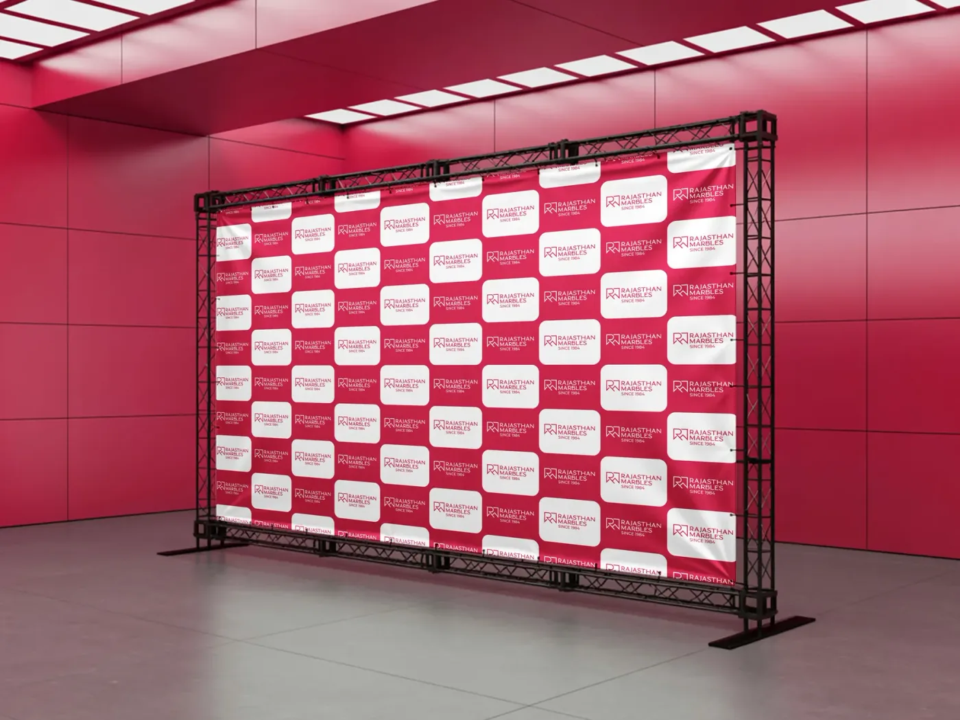


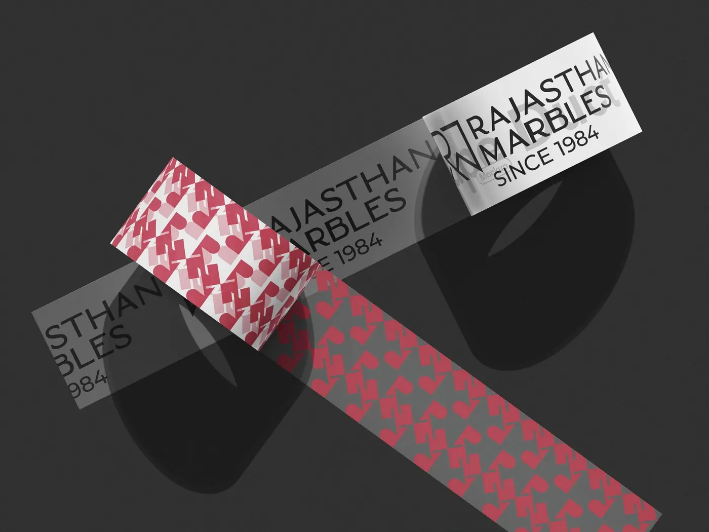
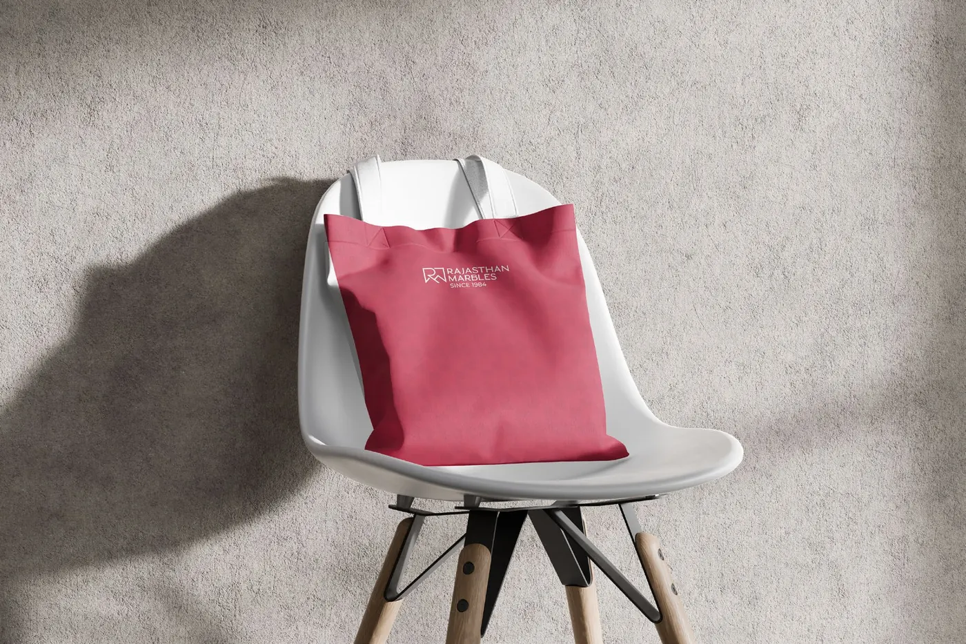

Applications shown are mockups from the brand book.


The test
The measure of success is simple.
The Rajasthan Marbles brand book sets one test for the whole experience: customers should leave feeling certain, reassured and respected. The identity is built to pass that test at every touchpoint, from the first sign they see to the box they carry home.
This case study covers the identity system. It does not include campaign or sales performance, so no results are claimed here.
Questions
Questions people ask about brand identity.
Straight answers, using this project as the example.
How do you build one identity for a company that sells many categories?
Anchor it on a promise that sits above the products. Rajasthan Marbles sells seven categories, so the identity is built on certainty and guidance rather than any one product. The mark, the doorway pattern and the voice stay constant; imagery adapts per category.
What should a brand book include?
The thinking and the rules. This one covers purpose, vision, mission, values, audience, personality, positioning and promise, then logo usage, colour, typography, patterns, tone of voice and applications such as vehicles, uniforms, packaging and signage.
Why would a building materials brand choose a calm identity?
Choosing materials is a high-stakes decision made among many options and loud claims. A calm, guiding identity stands apart from that noise and matches what buyers actually need: help narrowing down, not more pressure.
Can a brand pattern come from the logo itself?
Yes, and it is often the strongest option. The RM Continuum is the R from the logo, reduced to its curve and repeated into a doorway. A second pattern comes from the logo's negative space. Both keep the brand recognisable when the logo is small or absent.