

Brand case study · 8-minute read
Everyone sells a blank page. We built a brand that sells the finished thing.
ModDwell makes living products that arrive finished, named and ready to be chosen. Zeekoi gave them one warm, recognisable face, and found the entire visual system hiding inside a single window of the logo.
- Client
- ModDwell, glass-integrated living products
- What we made
- Brand identity, verbal identity and a full brand book
- The idea
- Create products before projects
- Inside
- Names · Pattern · Look · Voice · Applications
The goal
Be the product people ask for by name.
ModDwell wants choosing the things you live with to feel as considered as choosing a floor or a wall finish. Not a last-minute purchase. A decision with taste in it.
That changes the job of a brand. Reassurance isn’t enough. It has to make a product worth wanting before anyone has a project, and it has to work for three very different people at once.
“I want that.”
The homeowner. Desire comes first, then an easy, well-judged choice.“I won’t have to redesign it.”
The architect. A product resolved enough to specify again.“I know what’s arriving.”
The builder. Interfaces and responsibilities stated plainly.

The problem
Most of what fills a home is described, not chosen.
Ask someone about their wardrobe or their partition and you’ll hear a description: the dark one, the sliding one, the one the carpenter made.
No name. Nothing to search, share or ask for again. Quality depends on one person’s hands, and the design burden sits with the customer. A brand can’t grow on something nobody can name.

~80%
of Indian home shoppers discover products through social media.
Deloitte India, 2026 · Medium–high confidence70–75%
of wardrobe volume is still made by local carpenters and small workshops.
IndexBox, 2026 · Directional, vendor estimate17.5%
is the organised, branded share of India’s home furniture market in 2025.
Ken Research · Directional, vendor estimateNo single report sizes this exact category. We read neighbouring markets together, and treat vendor estimates as directional.
- 01Describe what you want, in words.
- 02Wait for a drawing.
- 03Compare quotes that can’t be compared.
- 04Revise it.
- 05Hope it arrives the way you imagined.
“The dark one.”
- 01See it finished.
- 02Open it, close it, touch it.
- 03Choose the product.
- 04Choose the options.
- 05Handover, with one person who owns it.
“The Onyx.”
The idea
Create products before projects.
In a category that waits for a brief, ModDwell decided to arrive with something finished. The brand is built to make that decision visible and repeatable.
The product leads. The customer chooses. Customising comes afterwards, and only to personalise what is already complete.
Name it.
Short, sayable names with a reason behind them, so a product can be asked for.
Finish it.
Complete before customisation: a standard form, approved variants and honest limits.
Make it known.
Repeat the names, details and behaviours until people learn the whole range.
Names
A name people can say after they leave the showroom.
A model number tells you what something is. A name tells you what it’s like. ModDwell names products the way a studio names a collection: short, sayable and earned.
Different products get different personalities, from dark to light to kinetic, and the master brand keeps the family together. Finishes never rename a product, and customising never creates a new one. The descriptor sits beneath the name: ONYX wardrobe, TRIVIUM partition. And a product has to earn its name: if the name needs an invented story to justify it, it’s the wrong name.
What changes
Explore a territory
The pattern
It started with one lit window.
There’s one light on.
Somewhere in the dark, a single window is lit. A little crooked, as if the building is leaning in to listen. Keep your eyes on it.
You’ve been looking at it all along.
Pull back and it isn’t a spark in the dark. It’s the small yellow mark at the start of the name. A window, with the light on.
Give it neighbours and it becomes a building.
Twenty-four windows, six across and six down. Most stay a deep, quiet red. A few are lit. We read those as daylight, and as someone being home.
Look at how the lights are spread.
No two lit windows ever touch. So it never turns into a stripe or a switchboard. It looks like an evening: lived in, unplanned, and somehow just right.
Then it got bigger. It never got different.
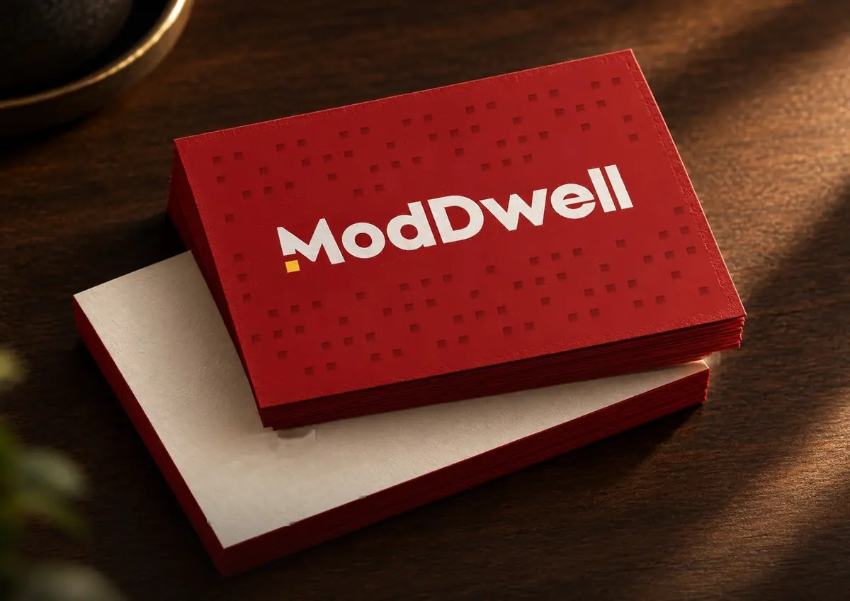
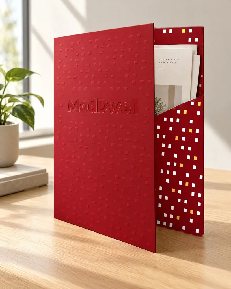
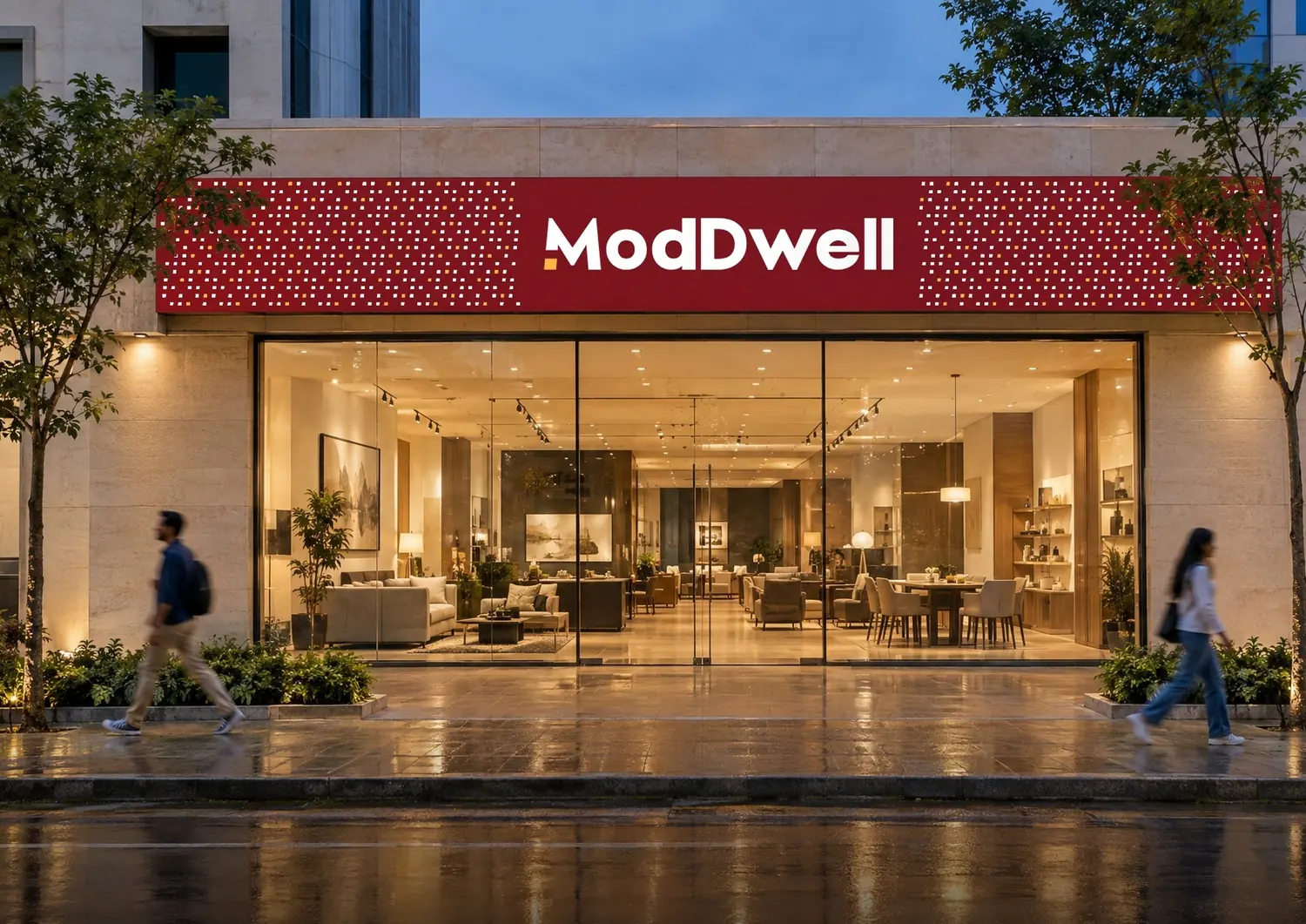
On a business card it’s a handful of windows. On a bag, a few more. On a hoarding or the side of a city bus, a whole street. About the same number of windows run across the short edge of everything, so a card and a bus feel like relatives.
Nobody added a pattern to the logo.
It was already in there, waiting for someone to notice the light was on.Some brands decorate. This one was lit from the inside.
The look
Warm on purpose.
Engineered products can feel cold. The palette goes the other way: sand and stone do most of the work, one confident red signs it, and yellow is used like a patch of daylight.
Four typefaces share the job with a strict ration. A clean sans does the reading. An elegant serif carries ideas. One tall condensed face gets a single loud moment, and a handwritten word appears once at most. That restraint is what lets the loud parts land.
Outfit · reads
Precision over approximation.
Body copy, labels, product information.
Canela · ideas
Look again.
Headlines and campaign lines. Italic for a word or two.
Druk · once
One loud set
One per layout, in capitals, never next to the handwritten word.
Brittany · a signature
with care,
A single handwritten word for a sign-off.
Type is shown in web stand-ins. The brand specifies licensed Canela, Druk Condensed and Brittany.
Three ways to see a product.
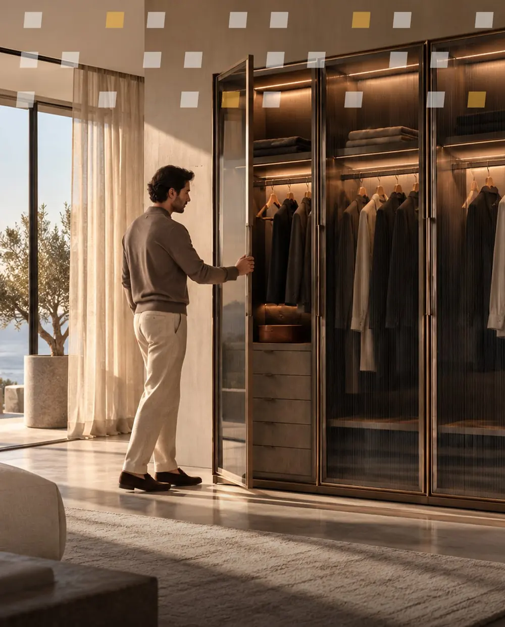
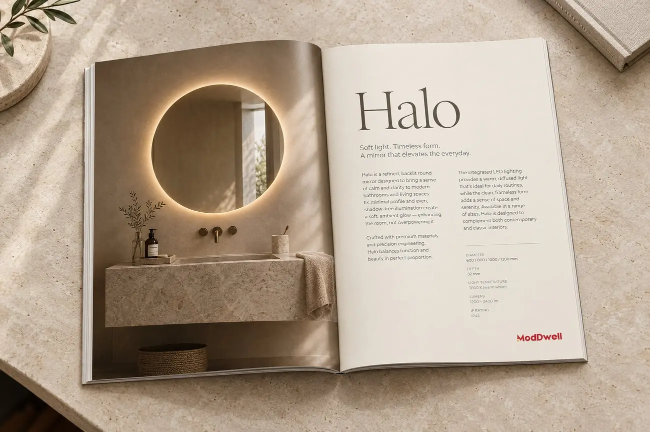
Every product is shown whole, in a real space, and up close, so it never becomes an anonymous element in a project photo.

The voice
Someone with taste who happens to know how things work.

ModDwell speaks like a friend with excellent taste: warm without being familiar, clever without needing to prove it, confident without getting loud. It never sounds like a consultancy describing design thinking.
It is exact where it matters: it says what was tested, what was specified and who owns the problem.
Words ModDwell won’t say
- premium
- world-class
- one-stop solution
- end-to-end solutions
- cutting-edge
- best-in-class
- last chance
Words it keeps
- notice
- enough
- look
- choose
- keep
- belong
- tested
- specified
This page follows the same word rules.
Instead of
“Forwarded to the concerned department.”
ModDwell says
“I own this from here and will update you by 4 PM tomorrow.”
Lines the voice is allowed to say
Not an art gallery apparently.
The view stayed despite the railings.
Wait. Look again.
In the world
Let the reaction do the selling.
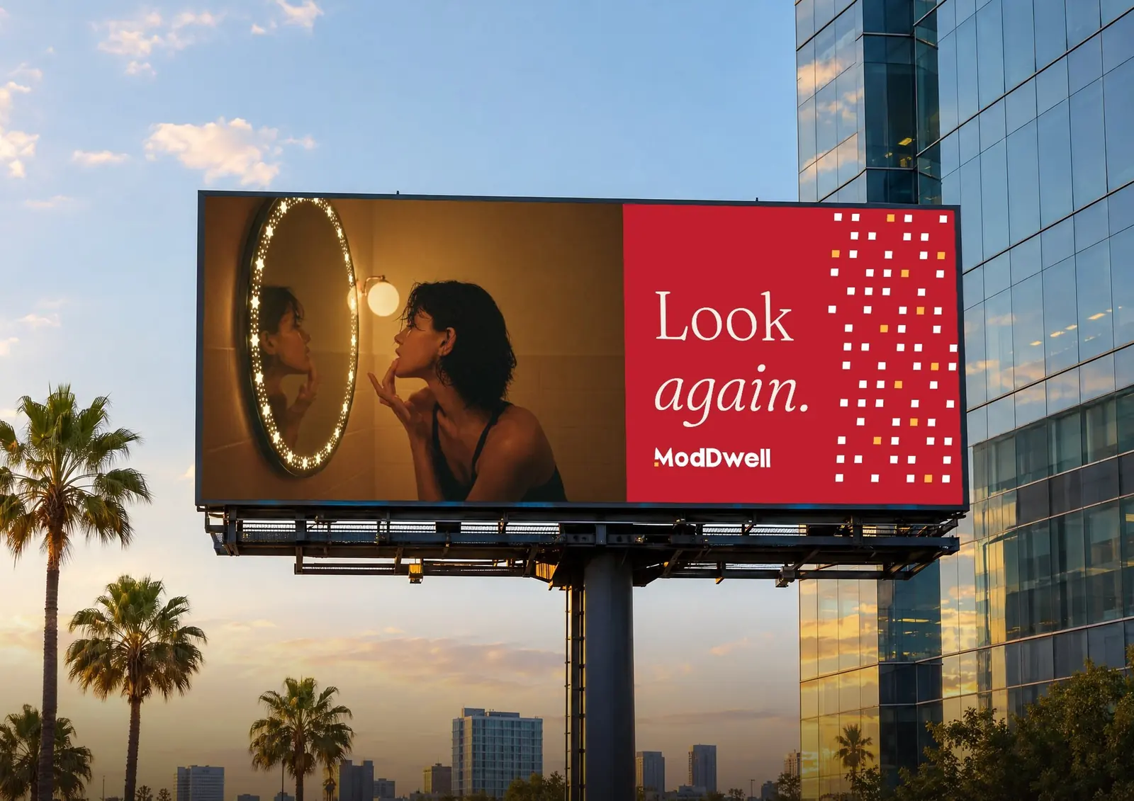
The product is the protagonist, but it rarely sits in the middle of the frame being admired. Someone notices it. Touches it. Photographs it. Asks about it. Human behaviour is the proof.
So the campaigns start with a reaction and let the viewer work out what caused it. Two words, one image, one logo. Look again. The showroom works the same way: staff are product experts with judgement, not salespeople.
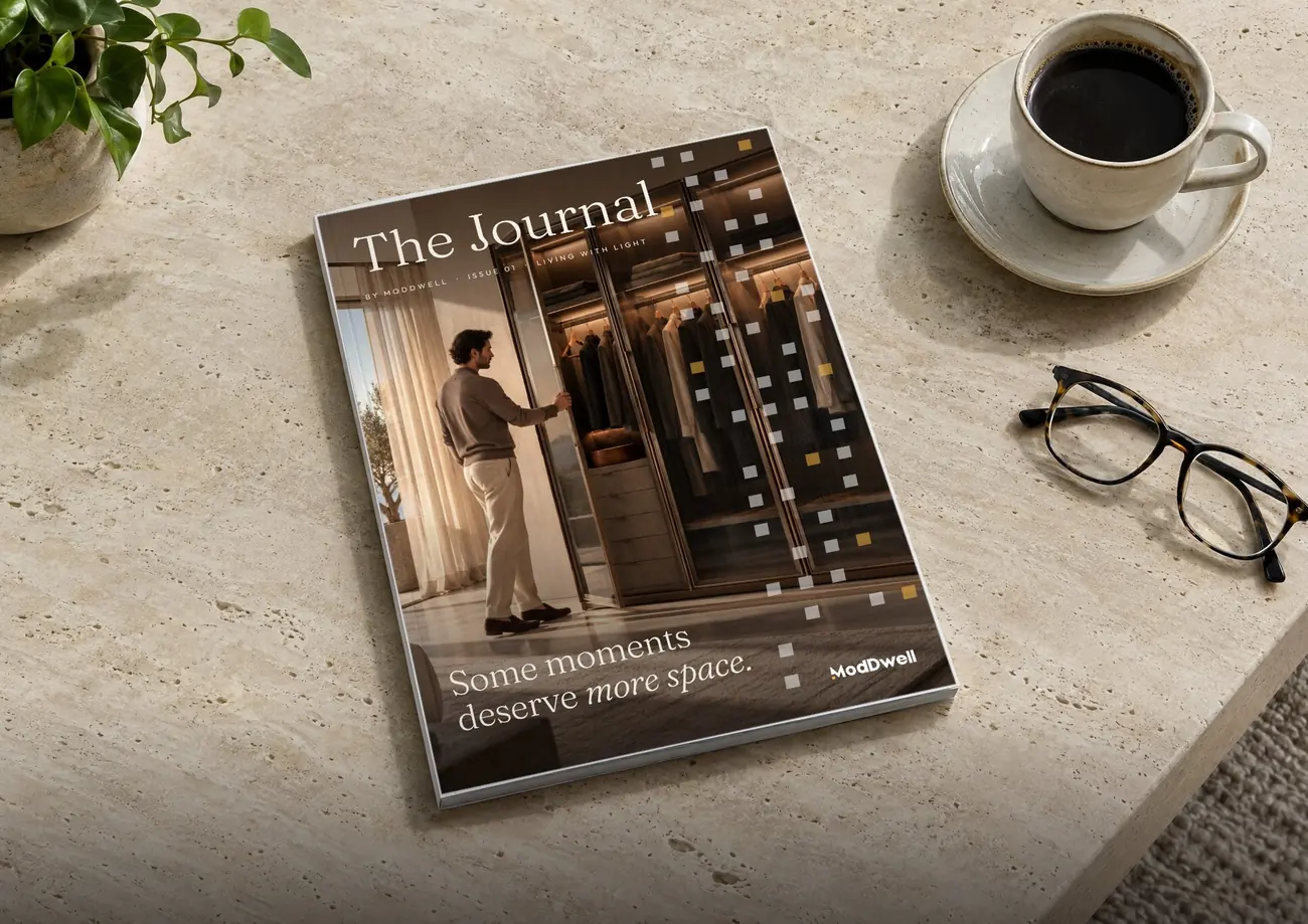

Everything it touches


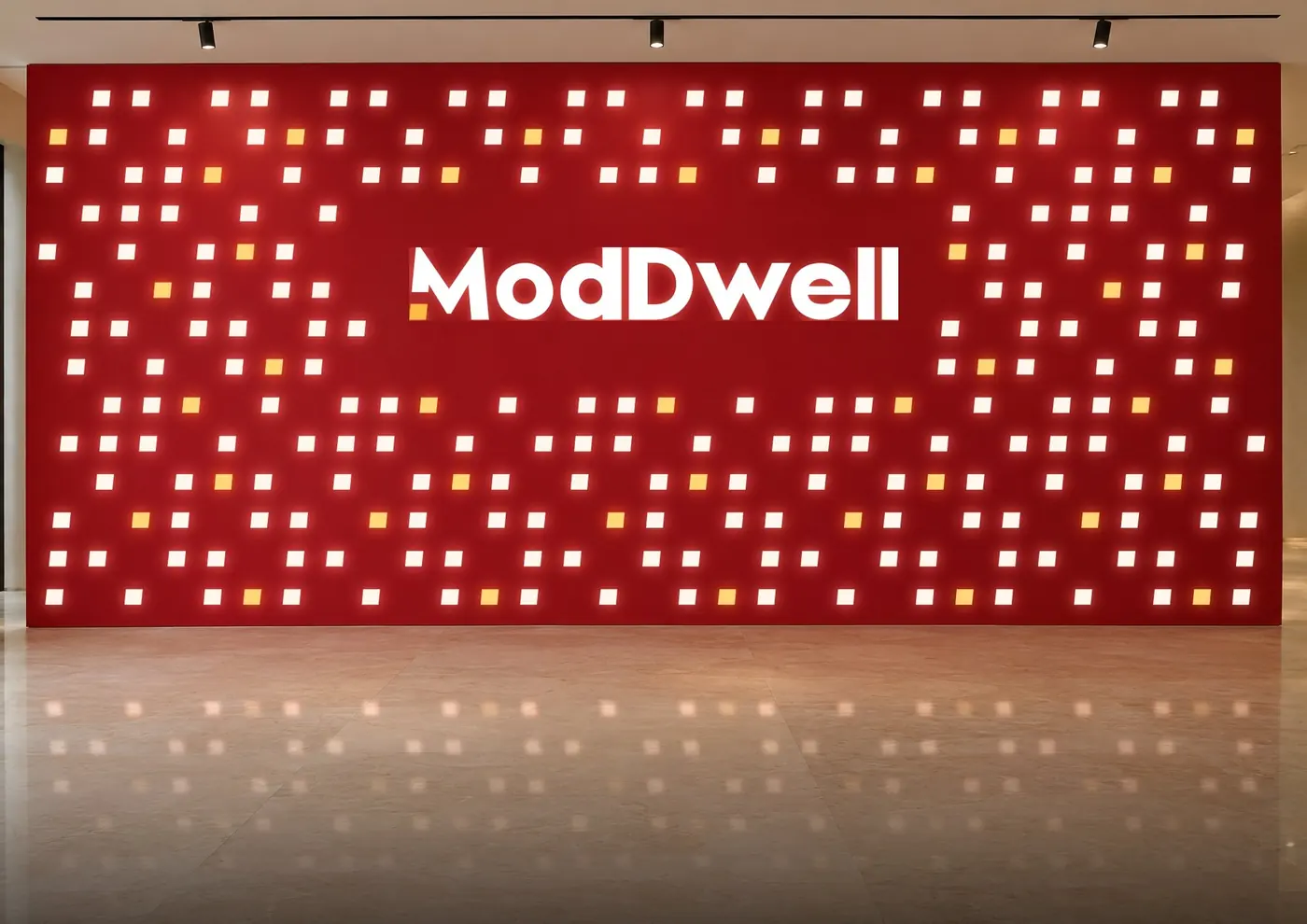
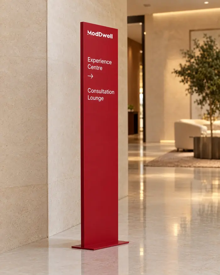
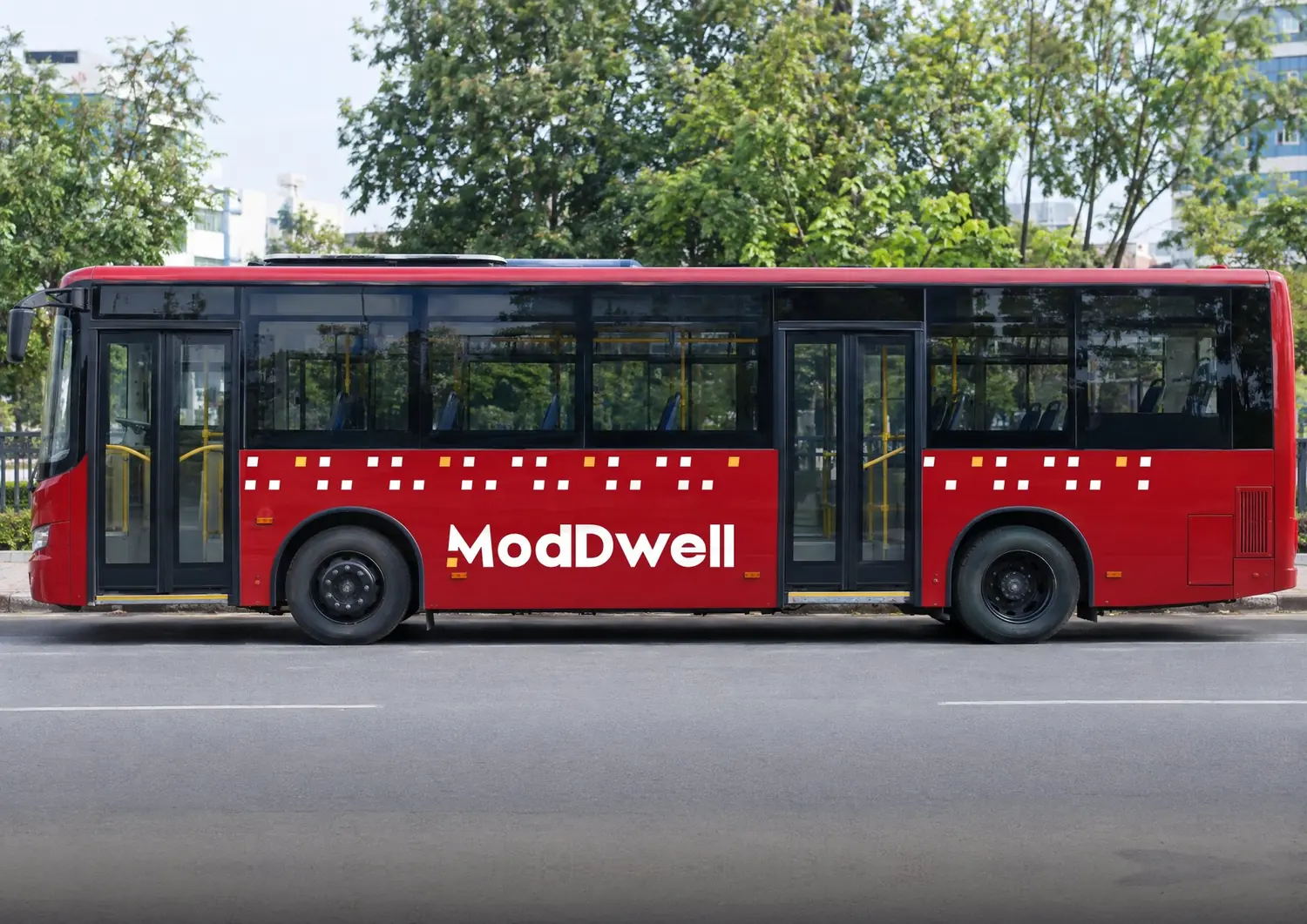
Not a whim
Six decisions, none decorative.
Every choice in the system can be explained out loud. These carry the most weight.
- 01
Product before project
Instead ofBuilding whatever is described
BecauseDesire has to come before customisation.
- 02
One-word names
Instead ofModel descriptions and numbered collections
BecauseA name can be asked for, searched and remembered.
- 03
A pattern drawn from the logo
Instead ofA decorative texture
BecauseOnly ModDwell can own it, and anyone can see why.
- 04
One scaling rule
Instead ofA list of exceptions
BecauseA card and a bus should look like one family.
- 05
Warm neutrals and one red
Instead ofA cold, clinical look
BecauseTrust is warmer than precision.
- 06
One visible owner
Instead of“Forwarded to the concerned department”
BecauseClarity is what good service sounds like.
The result
A brand with something to say in every room.
ModDwell now has an identity built for the way its category is actually bought: seen on a phone, chosen in a showroom, specified by a professional and lived with for years.
Recognition
A portfolio you can name.
A naming system that turns products into things people can ask for.
Signature
A pattern you can spot without the logo.
Drawn from the wordmark, sized by one rule, at home on a card or a bus.
Voice
A voice anyone on the team can use.
Rules for tone, words and humour, with a different register for each audience.
Behaviour
A showroom and service that act like the brand.
Staff who advise, and one visible owner for every issue.
How we’d measure it · recommendation, not a result
This case study covers the identity system. It reports no sales or market results, and we won’t invent any. As the brand goes live, these are the signals worth tracking:
- How often customers and architects use a product’s name unprompted in enquiries.
- Saves, shares and replies on product content, which show whether it is worth passing on.
- Architects specifying ModDwell products again on a second project.
- How quickly an enquiry becomes a product choice.
Questions
Asked and answered.
How do you brand a product that doesn't have a project yet?
Make it worth wanting on its own. ModDwell's identity gives each product a name, a finished form and a reason to exist before any client has briefed it. That way the first conversation starts with 'which one?' instead of 'what do you want us to make?'
Why give every product a name instead of a model number?
A model number describes. A name gets remembered, searched for and asked for. ModDwell's naming rules favour short, sayable names with a real idea behind them, so the aim is a customer who says 'I want the Onyx' rather than 'I want that dark wardrobe'.
What is a brand pattern for, beyond decoration?
It gives a young brand something recognisable without the logo. Lightwell is drawn from the single yellow window in the ModDwell wordmark, repeated in a fixed module, so it can only belong to ModDwell. One scaling rule keeps it consistent from a business card to a bus.
How do you keep a growing brand consistent across showroom, packaging and service?
Write the rules down where people can use them. Size comes from the item, not taste. Every product passes a completeness standard before launch. Every service issue has one named owner. Consistency then depends on the system, not on who is holding the file.
What did the market research say?
No single report sizes this exact category, so the research read neighbouring ones together: furniture, interiors and high-end housing. Home shoppers increasingly discover products on social media, most wardrobes are still made by local workshops, and the organised, branded share is small. Those signals support building a brand people can name and share.