
You can’t see what makes glass safe. So we built a brand that shows it.
TPRS Glass has made glass in India since 1995. Zeekoi gave that trust a face you can recognise from a street, a factory floor or a tender document: one blue, four lines and a weave with no one on top.

- Client
- TPRS Glass, a glass manufacturer serving architecture, automotive, vertical mobility, white goods, marine and engineering
- What we made
- Brand identity system and a 69-page brand book (Phase 1)
- One idea
- When quality can’t be inspected, the brand has to carry the proof
- Reading time
- 8 minutes, or 30 seconds below
The 30-second version
If you only read one part, read this.
The problem
A product whose quality you can’t inspect.
Safe glass and ordinary glass look alike. The difference lives in a mark, a certificate and, sometimes, what happens years later.
The insight
In glass, the brand is part of the product.
Buyers who can’t check quality themselves lean on who made it. So the identity has to carry evidence, not just polish.
The idea
Make the invisible visible.
Values drawn as lines. People drawn as a weave. Proof given its own protected space.
What we delivered
One system, 69 pages.
Logos and 7 product marks, a blue with a birthplace, 3 typefaces, 2 patterns, and rules from stationery to advertising.
The market
The one material you look straight through, and the one you can’t inspect.
Glass goes into buildings, vehicles, appliances and boats. Most of what matters about it is invisible to the person paying for it.
Economists have a name for goods like this.
Credence goods. These are goods whose quality buyers struggle to judge even after buying and using them. The idea comes from Darby and Karni, 1973. Glass isn’t a textbook case, so treat this as our lens rather than a finding.
But one failure mode fits it closely. In toughened glass, microscopic nickel sulphide particles can cause a pane to shatter on its own weeks, months or even years after installation. You can’t see the particle, and the glass can look flawless until the day it fails.
That is the job a glass brand has: to make trust something a buyer can see before they have to find out.
Try it
Which of these four panes is the safe one?
We drew them identically on purpose.
Illustration only. The corner mark is generic, not an official mark. Indian safety glass must carry the BIS Standard Mark on each piece.
The insight
Good glass disappears. The trust shouldn’t.
Buyers want
Glass that stays whole for decades, and certainty they chose the right maker.
The product gives them
Almost nothing to inspect. Clear is clear, whoever made it.
TPRS can answer because
Three decades in glass, domestic and international certifications, and a stated set of values to be held to.
Every part of the identity does one job.
We took TPRS’s four TREE values and asked of every design decision: what invisible thing does this make visible? The ledger below is the answer. Nothing in the system is decoration.
01 · The values
Most values hang on a wall. These run off the page.
How do you make a value visible?
Take one line.
It drops in from the edge of the page, turns a right angle and keeps going. It doesn’t stop at a border, a margin or a logo. Hold on to that.
Then give it a family.
Eight lines: four from above, four from below, nested like the edges of a letter T pulled out into the world. The T in TPRS, stretched into a path that never ends.
Now look between them.
Four dashed channels run through the gaps. Two climb, two descend. Each one carries a single value, and the dashes are moving. A value in motion, not a word on a wall.
First: Transparency.
Honesty and openness in every process, so clarity and trust follow. For a company whose product is the one material you look straight through, it is the value the product already performs.
Second: Responsibility.
Ethical practice, sustainability, promises kept. It climbs beside Transparency, because when a safe pane and an unsafe pane look identical, a promise is only as good as the proof behind it.
Third: Efficiency.
Using resources well and delivering without friction. It is the first channel to turn down, toward the floor, where a promise stops being a sentence and becomes a process.
Fourth: Empowerment.
Growing the team and the partners who innovate with TPRS. The last channel, and the only one that is about people. Which is exactly where the second pattern begins.
A value on a wall asks you to believe it.
A line asks you to follow it. Four of them, running off every page TPRS prints, in a category where the product can’t speak for itself.
Trust you can trace to the edge of the page.Lines and channels are taken straight from the brand book’s pattern artwork, not redrawn.
The discipline: the TREE is the primary pattern, and it keeps covers, dividers and closing pages. It sits in corners, with the centre of a line exactly on the layout edge so the crop always looks intentional. Skywave lines on dark, deep blue on light. It’s required on printed and official digital material, and optional on social, where layouts stay light.

02 · The people
Every company is drawn as a ladder. This one is cloth.
How do you draw a company that isn’t a ladder?
Draw any company and you get a ladder.
One box on top, everyone else underneath. It is honest about who decides. It says nothing about who holds the place together.
TPRS drew straps instead.
Every designation, from the CEO and the CMO to the trainee, becomes one strap. All the same width. Not one is thicker for being senior.
Then they are made to meet.
Each strap crosses every strap running the other way, so every level connects with every other. Not a chain of command handed down from above. One interlinked structure.
Over one, under the next.
Follow a single strap. It passes over one, then under the next, and carries on. Nobody is always on top. Leadership and trainees hold the fabric together equally.
Pull one out.
Take the trainee away and the weave comes loose, exactly as it would for the CEO. That is the whole argument, made with nothing but cloth.
Everyone holds it up.Zoom out. It is cloth.
The Knot repeats in every direction from one seamless tile, able to fill any shape. The brand cuts it two ways: the Texture, quiet behind a statement, and the Knot, to mark a point.
Two patterns, one pulse.
Where a strap slips under another, the break is cut to the same line-to-gap rhythm as the TREE. What the company believes, and who holds it up, drawn by the same hand.
Same rhythm, so it reads as one company.Nobody is always on top.
One cloth, two grounds.
The discipline: the same cloth is cut two ways. The Texture is a quiet tone behind a statement, filling its panel edge to edge and never laid over a photograph. The Knot is the small version: it marks a key point, divides sections or signs off, and never stands in for the logo. One device per layout, one tone per device, and the TREE still opens and closes.
Knot and Texture are cut from the brand’s Weave artwork, not redrawn. Designations are shown as examples, as in the brand book. The org chart in the first beat is our illustration of a typical ladder.
03 · The origin
A blue with a birthplace.
What does trust look like when it also has to say where it comes from?
TPRS Blue is taken from indigo, the dye long tied to Indian craft and strength. The word itself traces back to a Greek term meaning “from India”, and the brand uses that as a quiet statement of origin: a company that began in India and now reaches beyond it.
Four secondary colours widen the range. Deep Ocean and Skywave add depth and light, Solar Spark is the warm accent, and Mountain Peak grounds text. A gradient from the primary blue into Deep Ocean is reserved for banners, headers and hero sections.
Why it mattersThe blue reads as calm and dependable, and it carries a fact about the company that nobody has to be told.
TPRS Blue
Primary. Trust, craftsmanship and innovation, drawn from indigo.
Deep Ocean
Secondary. Depth and clarity, and the far end of the brand gradient.
Skywave
Secondary. Light and openness. Used for pattern lines on dark backgrounds.
Solar Spark
Secondary. A warm accent used sparingly.
Mountain Peak
Secondary. Grounding charcoal for text and structure.
TPRS Blue into Deep Ocean
For banners, headers and hero sections.
04 · The maker
One mark. Room for every product.
How do you keep a growing family of products recognisably one company?
The primary logo is the TPRS wordmark on clean, calm backgrounds. A secondary version sits on a blue patch for moments when a busy photo would swallow it, and a black-and-white version covers partnerships and print.
Product logos follow a single rule: the product name sits under the TPRS mark, bottom-right, in capitals, in the same blue. The system is built so the next product slots in the same way.
Why it mattersA buyer can tell at a glance that every product comes from the same maker, and a new product never arrives as a stranger.
Trusted leader in the glass industry (Since 1995)
Primary
Clean and neutralThe default. Used wherever the background is calm.Secondary
On a blue patchFor busy or high-contrast imagery. Used only when the primary can’t be read.Black and white
For partners and printCollaborations, co-branding and single-colour printing.


One rule, seven products. Add an eighth and nothing else changes.
05 · The voice
A calm voice, a loud one, and a Tamil one.
What does the brand sound like when it is written down?
Outfit does most of the work. It runs from Thin to Black, so headings, subheads, body copy and captions all come from one family. Impact, inspired by the heavy logo, is kept for short, high-impact lines such as campaign titles, and never for body text.
The book also specifies a Tamil typeface, so Tamil-language communication follows the same rules as English.
Why it mattersA tight type system keeps documents, tenders and ads looking like one company, whoever produced them.
Hierarchy sample written for this case study. Impact and Tamil shown with system or web stand-in fonts.
06 · The proof
Proof has to travel.
What does a brand do when its product can’t speak for itself?
This is where the idea becomes operational. The system doesn’t only look good on a poster; it gives proof somewhere to live on every document and surface the company produces.
Why it mattersEach of these answers one question a careful buyer is already asking.
What does it do?
Icons that name each property
A minimalist line-icon set covers the properties buyers ask about. Where a background is busy, the icon sits inside a blue or white circle.
Is it certified?
Marks get their own space
Co-branding rules give certification and regulatory marks protected clear space, so proof is never crowded out by a partner logo or a headline. Stationery carries the standards marks too.
Can I believe the claims?
Advertising that holds back
Every ad carries one main message, backed by verified information. Misleading imagery, unsupported comparisons and exaggerated claims are ruled out, and the designated brand representative signs off before anything runs.
The brand book also sets three letterhead types for three readers: internal, external customers and quality teams, and formal or government correspondence. Each carries only what its reader needs.
07 · The test
Where a system proves itself.
Does it still hold on a truck, a cap and a stage?
A brand system is easy to admire on a clean page. It gets tested on a delivery truck, an outdoor display, an event wall, a cap and a mug.
Same mark, same blue, same pattern, on every surface.
Why it mattersIf it only works on a slide, it doesn’t work.


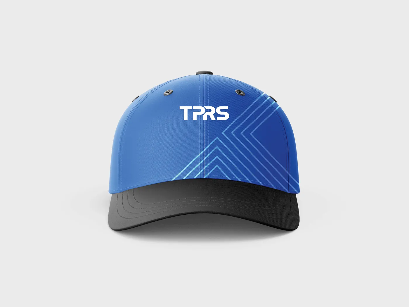

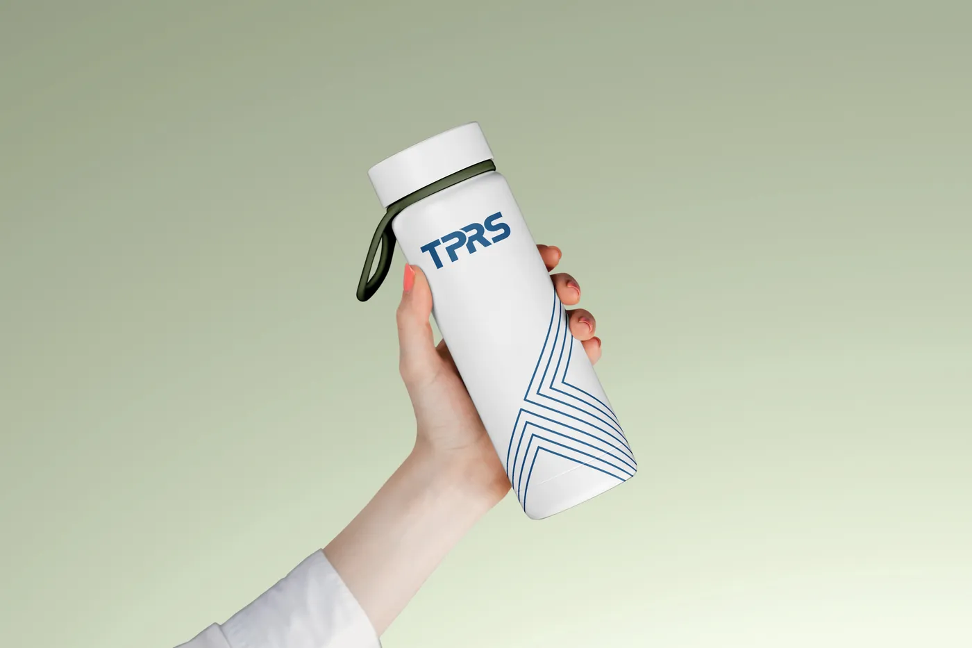

Applications shown are mockups from the brand book.
The point
Make trust easy to check.
For a product buyers can’t inspect, the identity can’t just be attractive. It has to be a set of visible habits: values you can see, proof with room to breathe, claims that hold back. That is what the TPRS system is built to do.
This case study covers the identity system. It does not include sales or campaign performance, so no results are claimed here.
Questions
Questions people ask about branding hard-to-see quality.
Straight answers, using this project as the example.
How do you brand a product people can't inspect themselves?
Make the proof visible everywhere the buyer looks. For TPRS Glass that means an identity built around evidence: values drawn as a pattern, certification marks given protected space, icons that name what a glass actually does, and advertising rules that rule out exaggerated claims.
What is a credence good, and why does it matter for branding?
Economists call a good a credence good when buyers struggle to judge its quality even after buying and using it. The term comes from Darby and Karni (1973). When quality can't be checked directly, buyers lean on the maker's reputation and on visible proof, which makes the brand part of the product.
Why would a glass manufacturer need a pattern system?
A pattern turns abstract values into something recognisable at a glance. TPRS has two. The TREE pattern is drawn from the letter T in the logo and keeps covers, dividers and closing pages. The Weave is a secondary pattern of interlaced straps, used softly behind a statement or as a small marker. Both are rule-bound so they stay consistent on stationery, packaging, exhibition screens and vehicles.
How do you design one identity for many product lines?
Fix the structure and let the names change. Every TPRS product logo is the same wordmark with the product name placed under it in the same position and style, so new products slot in without redesign and every line is visibly from the same maker.
What should a brand book for a manufacturer include?
Logo rules, colour, typography, patterns and applications, plus the working standards a company needs day to day: co-branding, icons, stationery, event banners, advertising and announcement standards. The TPRS book covers all of these in 69 pages.